Breadth 1:
Blind Contour Portraits in Illustrator
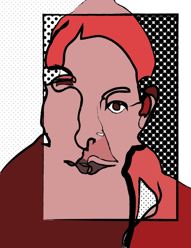
You will render a blind contour self portrait in Illustrator. This project will help you become familiar with stroke properties, brushes, live paint, swatch libraries, the layers toolbox, and the pencil and direct select tools.
The primary elements explored in this project are line, shape and color. The primary principles are unity, contrast, and emphasis.
The primary elements explored in this project are line, shape and color. The primary principles are unity, contrast, and emphasis.
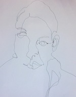
1. Begin with a blind contour drawing of yourself. Do a couple versions until you make one you like. No cheating!
2. Place a digital copy of your drawing into a new document in Illustrator. Lock the layer, make a new one.
3. Using the pencil tool, retrace your image. When you are finished duplicate the layer. Lock the duplicate, and hide it.
4. Make the traced image a Live Paint object. You may use only one color, plus its tints, shades and tones.
5. Paint in a few areas using up to 3 related patterns from the Patterns: Basic Graphics swatch libraries.
6. Turn on the duplicated layer, and unlock it. Change the stroke quality by selecting the lines and applying different brushes under the Artistic menu.
Breadth 2:
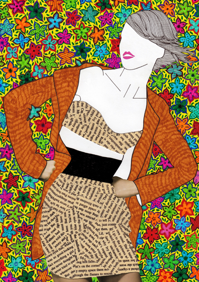
Zen Doodle / Valentina Ramos
"Dreams of India" by Valentina Ramos
|
Project one is inspired by a combination of Zen Tangle/Zen Doodle and the work of Valentina Ramos. The primary elements explored in this project are line, shape and value. The primary principles are repetition, contrast, and emphasis.
For this project, you will be filling a composition with different patterns created by lines and shapes, creating contrast through value. Different values can be created by changing the density of the patterns you create. You may design your own composition for this project, or follow the directions below. |
Begin by drawing 5 to 7 geometric shapes on a piece of watercolor paper. Each shape must overlap with at least one other shape. Next, look for a "cool" silhouette to trace from a magazine. Transfer your tracing onto the watercolor paper with the geometric shapes drawn on it. Once you have transferred your traced silhouette/outline, you can begin filling in the areas created by the overlapping shapes and silhouette with doodles. Areas that do not have a shape or a silhouette will be left white. Areas that fall within the silhouette should be filled in with a darker doodle. Areas that are part of the geometric shapes we drew will be filled in with lighter doodles. See below for clarification.
Use your pencil lightly! We will be going over our designs with permanent marker and washes of water color.
Use your pencil lightly! We will be going over our designs with permanent marker and washes of water color.
My example has 36 areas created by the overlapping of the silhouette and rectangles (geometric shapes).
|
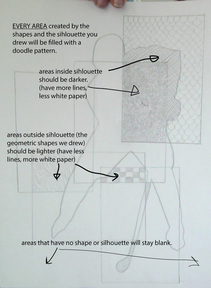
Every area will be filled with a doodle.
Areas inside the silhouette will be filled with dark doodles. Areas in the geometric shapes will be filled with light doodles. |

A "lighter" doodle. It looks lighter because there is more of the white paper showing in the design.

A "darker" doodle. It looks darker because there is less of the white paper showing in the design.
|
Breadth 3:
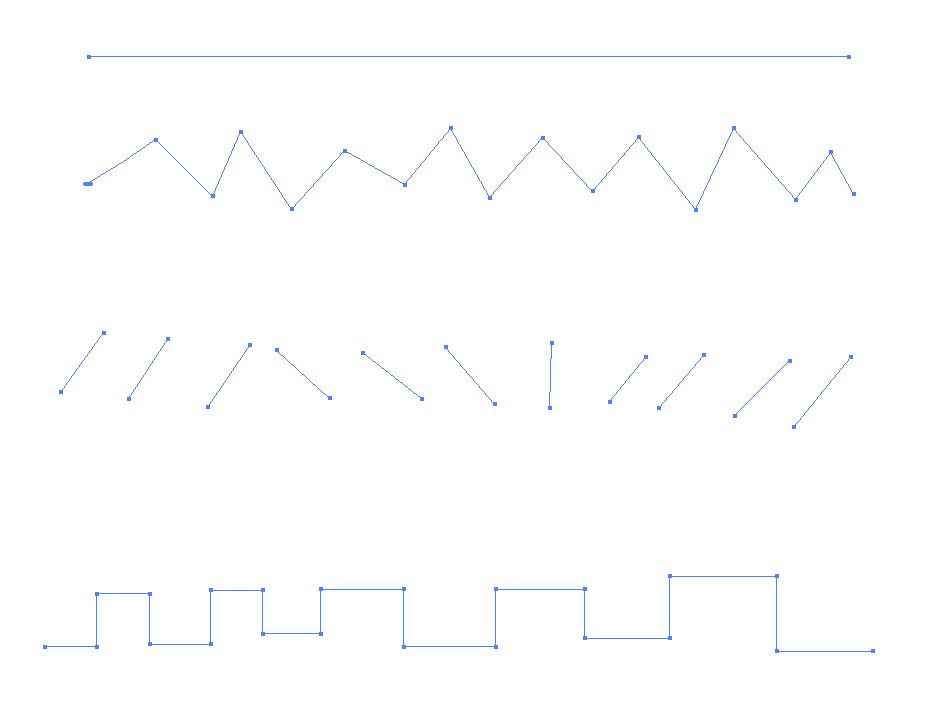
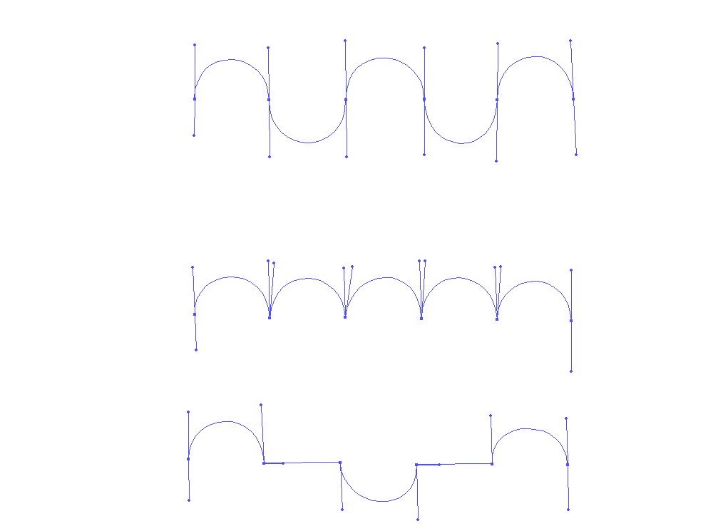
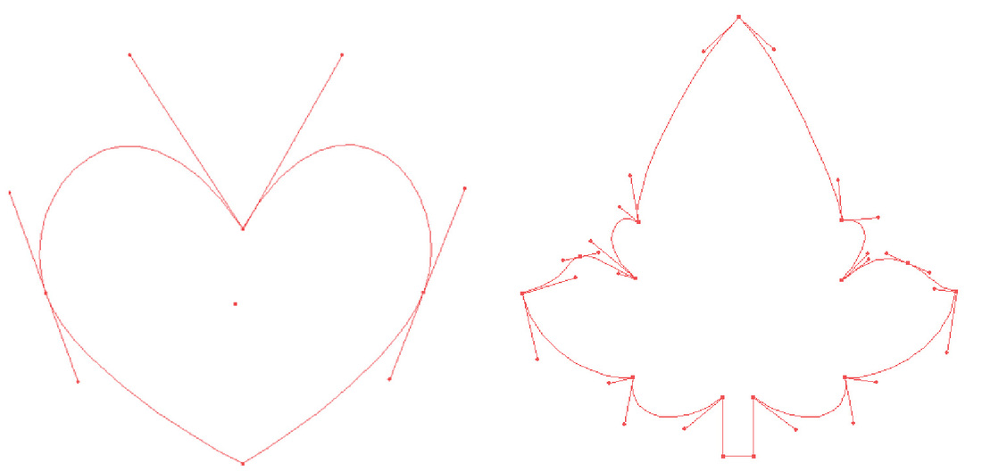
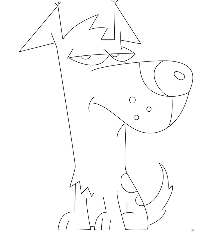
Image trace in Illustrator
You will be using Illustrator to transform a digital photograph.
The photo can be a picture you took here on campus, or a picture you bring in from home.
The photo can be a picture you took here on campus, or a picture you bring in from home.
Illustrator practice docs:
|
|
|
|
|
|
More Practice:
| pentool-exercise.ai |
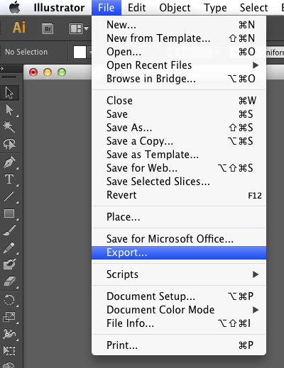
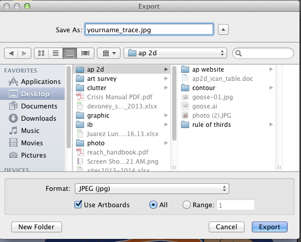
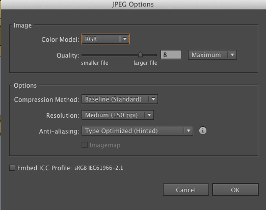
Saving your Illustrator File as a JPG:
|
Step 1:
|
Step 2:
|
Step 3:
|
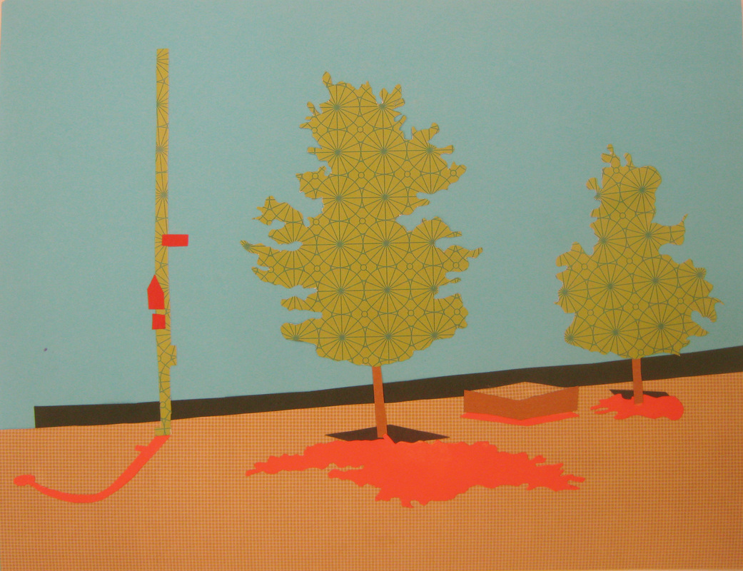
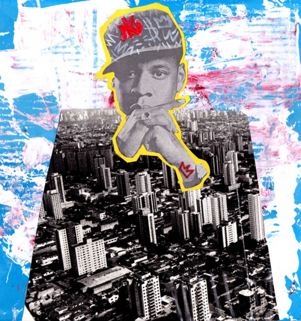
Breadth 4:
Site Specific Art and Artistic Interventions
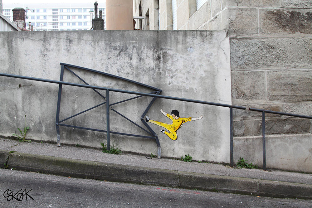
A piece by street artist OakOak
Below is the link for the tutorial on how to use live paint in Illustrator:
http://phototeacher.weebly.com/live-paint-in-illustrator.html Below is the tutorial on how to place your drawing back on the original color photograph:
|
You will be creating a site specific work of art that combines photography and Adobe Illustrator.
We are not actually making the interventions, but using Illustrator to draw what the intervention might look like - the final product will be an illustrator drawing of your intervention placed on top of the photograph you took. Check out the links below for some inspiration: http://www.thisiscolossal.com/2014/09/david-zinn/ http://www.thisiscolossal.com/2014/09/window-silhouettes-by-pejac-interact-with-the-outside-world/ http://www.thisiscolossal.com/2013/01/new-interactive-street-art-from-ernest-zacharevic/ http://www.thisiscolossal.com/2014/08/site-specific-street-art-by-jps/ http://www.thisiscolossal.com/2014/07/oakoak-street-interventions/ http://www.thisiscolossal.com/2013/01/brilliant-urban-interventions-by-oakoak-turn-crumbling-city-infrastructure-into-a-visual-playground/ | ||||
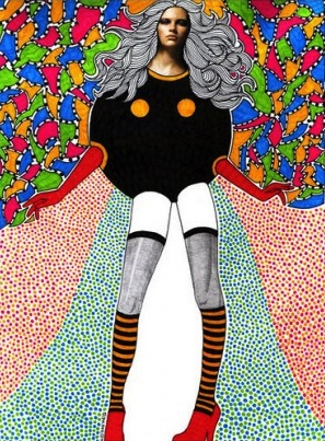
Breadth 5:
Peter Mars Project
Peter Mars Project
|
Peter Mars is a contemporary artist who makes work by layering image and text. His work is heavily influenced by Pop Art.
Check out his work: http://petermarsauthentic.com/artwork/ We will be making a Peter Mars inspired artwork using Photoshop. Click below for the tutorial.
| ||
Breadth 6:
Artist's Choice
Breadth 7:
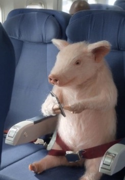
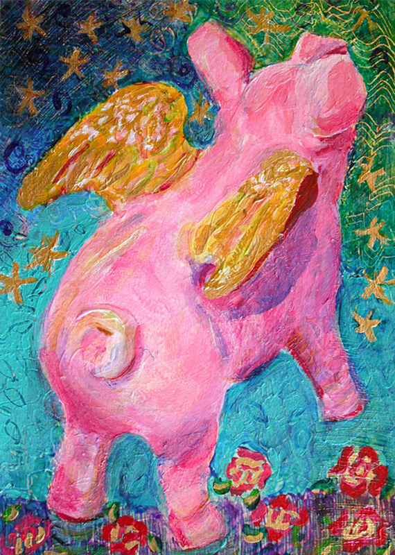
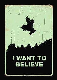
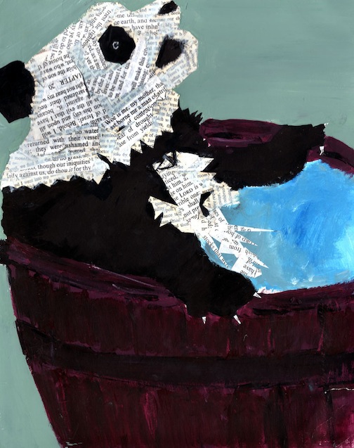
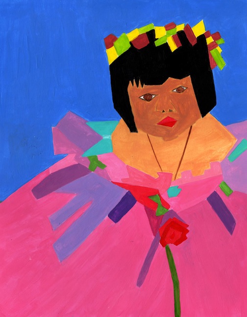
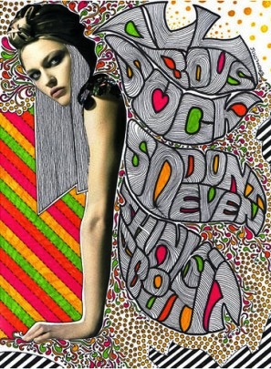
When Pigs Fly (Illustrating Idioms, Proverbs, and Quotes)
SOI: The creation of effective compositions communicate visual interpretations of idioms, proverbs, or quotes.
Inquiry Questions: What is an idiom? A proverb? Can I give an example? How can I create an original illustration of an idiom, proverb or quote? When being cliché or using clichés in art acceptable?
An idiom is an expression or saying whose figurative (metaphorical) meaning is different that its literal meaning. For example, "when pigs fly" is an idiom which means "never going to happen" and does not refer to pigs flying. Likewise, when you say "break a leg," your saying "good luck;" you are not telling someone to actually break a leg. In Spanish, the word is "modismo."
A proverb is a short, popular saying that expresses a commonly accepted truth or thought. Oftentimes they are metaphorical. For example, "early to bed and early to rise, makes a man healthy, wealthy and wise;" or "since we cannot get what we like, let us like what we can get."
A quote is a statement made by someone. If you choose to use a quote, and you are including text in your design, you must also include in your design the name of the person you are quoting.
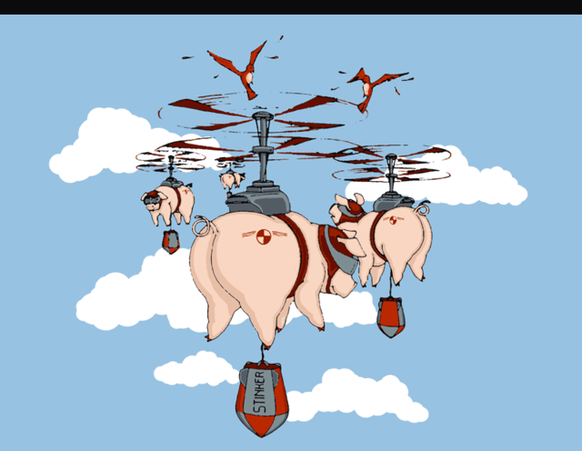
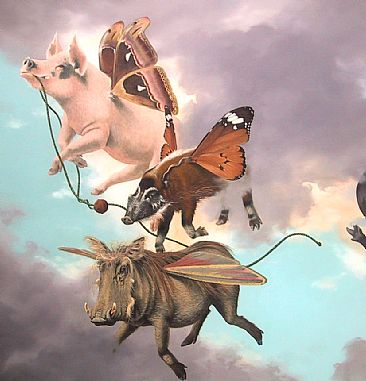
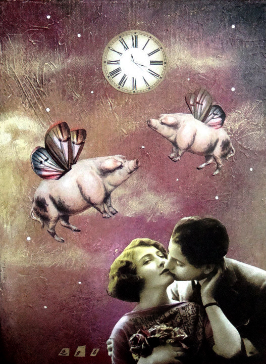
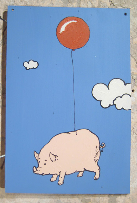
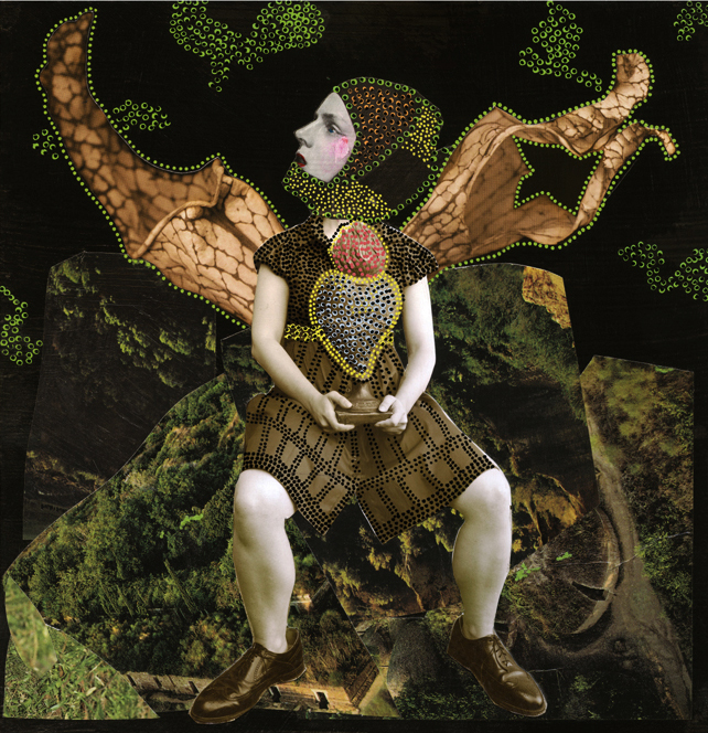
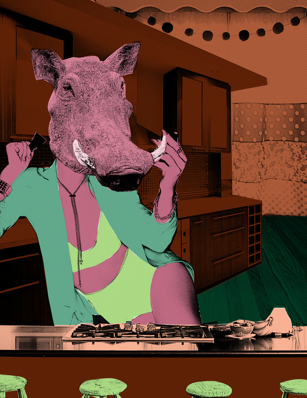
Below are some visual expressions of the idiom, "when pigs fly."
Your assignment is to create a project that illustrates an idiom, proverb, or quote (we will refer to these three collectively as a "saying"). You can choose the saying, and you can choose the medium. There is a LOT of ways this project can look. What you don't want to do is be cliché. Do a Google image search of your idiom. Try your best to make your project NOT look like the images that appear in the image search. In other words, be creative!
The requirements are:
The requirements are:
- the project illustrates, or is inspired, by an idiom
- the project is original - no copyrighted material
- the project may or may not contain text
- the project can be a painting, a drawing, a collage, a Photoshop or Illustrator project, or some combination of this list
- the project begins with at least one sketch of an idea
- the idiom, and project, must be school appropriate
Some links for idioms, proverbs, and famous quotes and their meanings:
http://www.smart-words.org/quotes-sayings/idioms-meaning.html
http://www.knowyourphrase.com/
http://examples.yourdictionary.com/examples-of-proverbs.html
http://www.designyourway.net/drb/famous-quotes-illustrated-through-minimalist-posters/
http://www.smart-words.org/quotes-sayings/idioms-meaning.html
http://www.knowyourphrase.com/
http://examples.yourdictionary.com/examples-of-proverbs.html
http://www.designyourway.net/drb/famous-quotes-illustrated-through-minimalist-posters/
Breadth 8:
Cut Paper Project
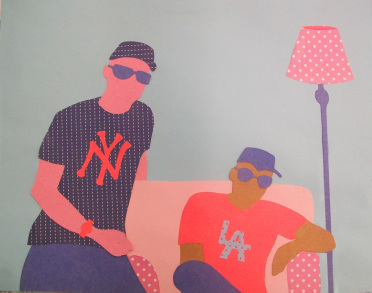
SOI: Changing medium creates an interpretation of a composition by changing the aesthetic.
Factual Question: Can I define aesthetic? Can I define collage?
Conceptual Question: How does medium affect the aesthetic of a composition? How can I use reference material to inspire new, original artwork?
Debatable Question: Is recreating an image in a new medium enough of a change to not violate copyright law?
You will use a photograph (your own, not from the internet) as the basis for a cut paper collage. You can use a picture you took here on campus, or a photograph from home.
Limit yourself to three colors, plus black and white. You can use up to three different patterned papers. The patterns might deviate slightly from your three color palette, but the overall/strongest color in the pattern must be one of the three colors you chose to work in. Light and dark versions of a color count as one color (light blue and dark blue will both count as one color, blue).
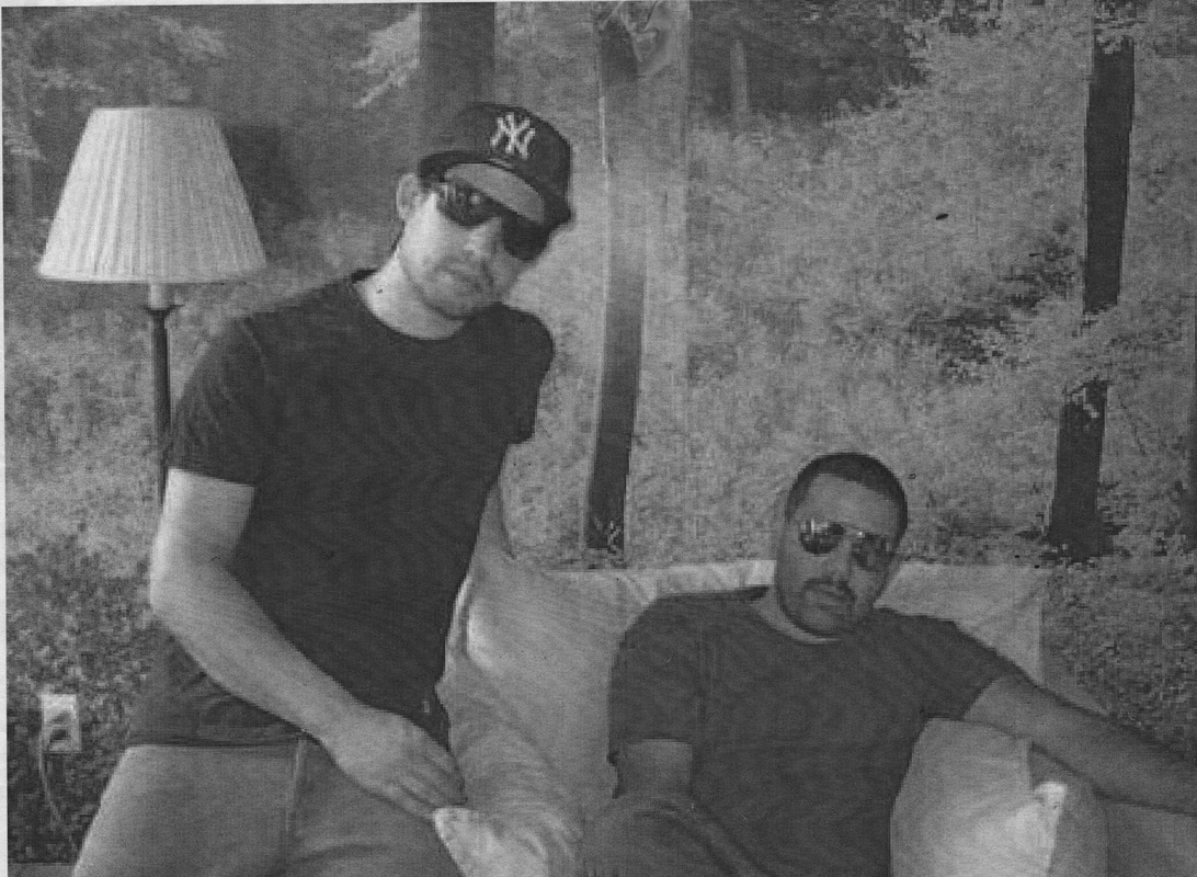
Choose a photograph to use, upload to the google drive for printing
|
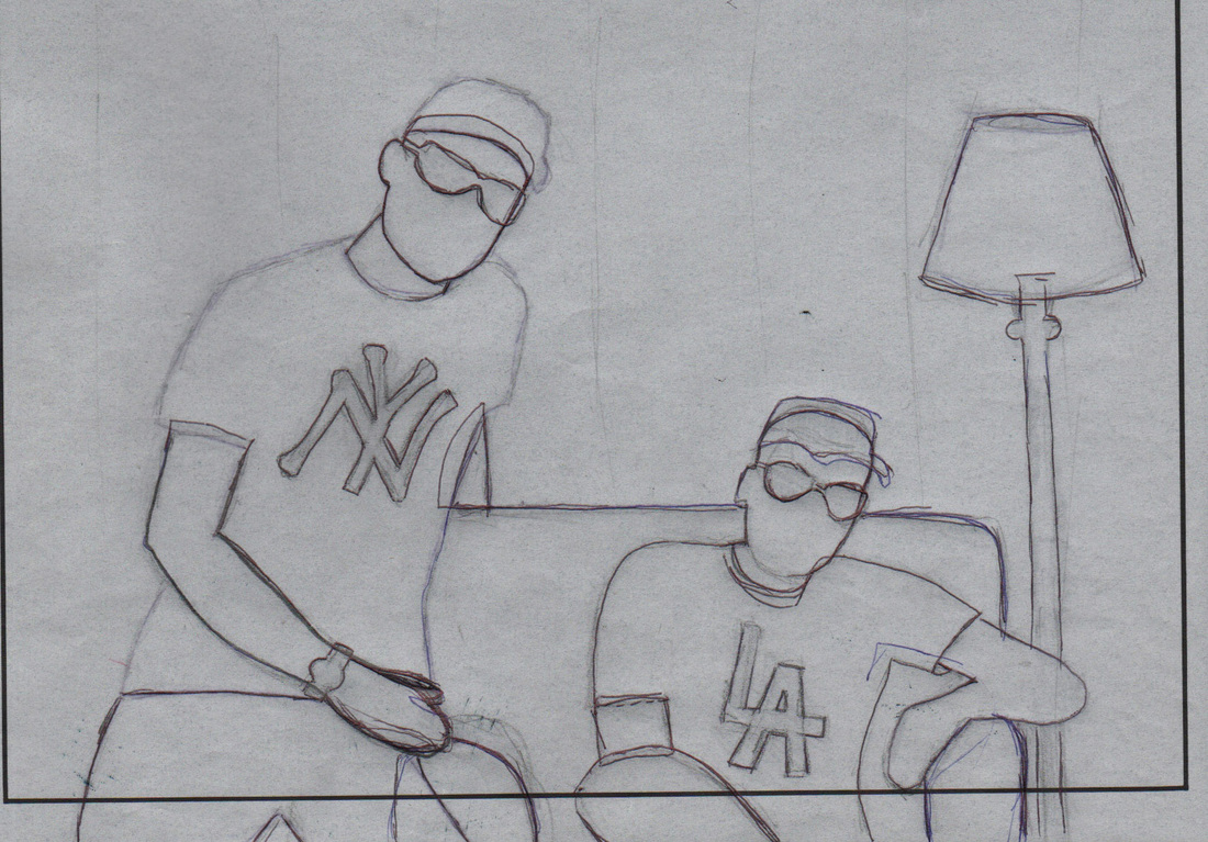
Trace the image onto tracing paper, simplifying the image as neccessary
|
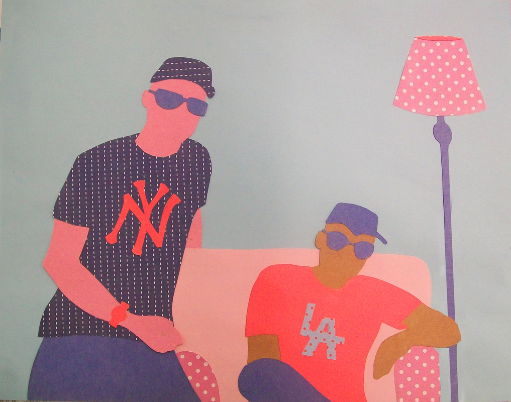
Transfer the image onto colored paper, cut and paste in place
|
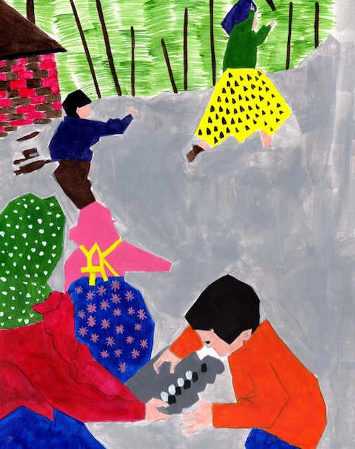
Breadth 9:
Flat Painting Project/Grid Painting
Flat Painting Project/Grid Painting
Student Sample
|
Flat Painting is a style of painting that has become popular in the last 10 or so years. This style produces a paint-by-numbers effect, where any value is represented not by gradual, smooth transitions (like a gradient), but rather distinct shapes or areas of different value.
Our next project will use something quite similar to this technique. We are going to start with a found image, then crop, abstract, and arbitrarily color the image to create an original artwork of our own.
Step 1:
Draw a 4" by 6" rectangle on a piece of tracing paper. Find an image in a magazine you are drawn to. Look for an image that has a medium amount of detail, at least three or four objects, and is larger than 4" by 6" in size. No Illustrations---Photographs only! Step 2: Lay the tracing paper over the image, cropping the image in an interesting way (keep the focal point out of the center!). Step 3: Trace the image, changing all curved lines into straight lines. You decide how much detail to include in the tracing (too little is uninteresting, too much is hard to handle). Step 4: Grid the traced image into 1/2" squares. Step 5: Draw an 8" by 12" rectangle on a piece of Illustration board. LIGHTLY draw a 1" grid in the rectangle. Step 6: Redraw the traced image into the new 8" by 12" rectangle. Use the grid as a guide. Step 7: Erase the grid and paint! Use an analogous, triadic, or complimentary color scheme. |
|
|

More student samples:
Tips for painting with acrylics:
- Rinse your brush before switching colors. Do not contaminate your paints with other colors!
- Mix colors on your palette or directly on the canvas.
- Mix as many of the colors you use as possible. "Straight from the tube colors" are not as interesting.
- Paint should only go up about half the length of the bristles. Paint should never reach the metal part of the brush.
- Rinse brushes you are not using. Do NOT leave brushes sitting in water. Do NOT leave wet paint on the brush.
- Dip your brush in water, then blot on paper towel, before you dip the brush in paint. This helps the paint release from the brush
- Dip the very tip of your brush in water before you paint. This also helps the paint release from the brush.
- Too much water on your brush will result in watery, transparent paint.
- Too little water will result in clumpy paint that is difficult to spread or achieve clean lines.
Breadth 10:
Mixed Media Project
Nikki Farquharson
|
You will be creating a mixed media project. This project will combine paint, magazine/cut paper, pencil, marker, oil pastel, and/or charcoal. You need to combine at least 3 of these mediums (can be more).
The subject matter is entirely up to you, but it must be original-- don't break copyright rules! Also, you must keep it school appropriate. Be sure to keep in mind the rule of thirds- make a focal point! - don't put it in the center of your composition! http://www.greateclectic.com/ http://www.robertgullie.com/artwork/#/collages/ http://www.basquiat.com/artist.htm http://cargocollective.com/johnparot http://www.nikkifarquharson.com/ |
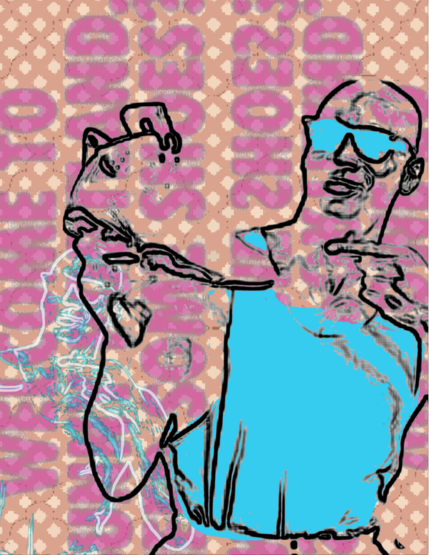
Breadth 11:
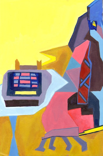
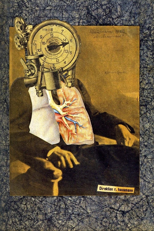
Dada/Warhol Mash-up
|
For the Head:
For the Body:
For the background:
Click here for the link to the color palette generator. To finish the image, follow this tutorial:
| ||
Breadth 12:
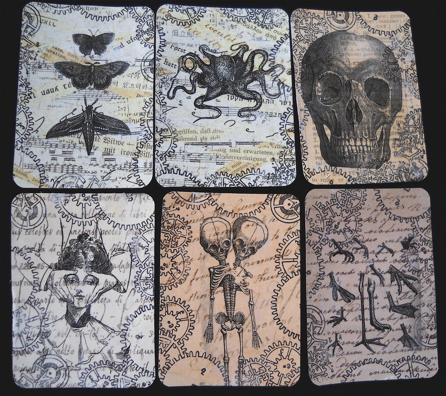
Artist Trading Cards
Click below to look at the presentation we viewed in class.
|
ARTIST TRADING CARDS are miniature works of art created on 2 ½ X 3 ½ inch card stock. They are original, small editions and, most importantly, self-produced. Anybody can make them. The idea is that you trade them with other people who produce cards, either in person or by mail. The project was initiated in 1997 by zurich artist M.Vänçi Stirnemann. Since then several hundred people from all over the world have traded ATCs.
ATC's usually have a common theme and aesthetic across a series. Cards are often made of a multitude of materials, sometimes with objects like ribbons and buttons glued on as well, though just one medium can be used. This project will help us think about our concentrations. You will design your own series of ATC's, SIX cards to be exact. You can choose the materials and the theme. The requirements are:
| ||||||
Breadth :
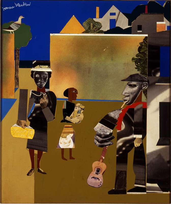
Dada or Bearden Collage
|
Your Assignment Option 1:
You will create a Romare Bearden inspired collage using magazines and cut paper, and any other materials you wish (fabric, newspaper, paper towels, etc.). You will use an “old master” painting as a loose template for the subject matter and composition. (modernize the subject matter, we don’t have milkmaids anymore). NO PORTRAITS but the painting MUST INCLUDE at least ONE PERSON Link to "old masters": http://en.wikipedia.org/wiki/Old_Master |
|
Your Assignment Option 2:
Create a Dada Inspired Collage. You must include: • a “character” some kind of person/creature thing composed of different pieces of images • a foreground, middle ground and background • cut paper shapes, can be patterns or painted paper • overlapping! • a focal point! Below is a link to the presentation we viewed:
| ||
Breadth :
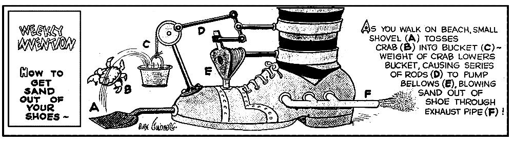
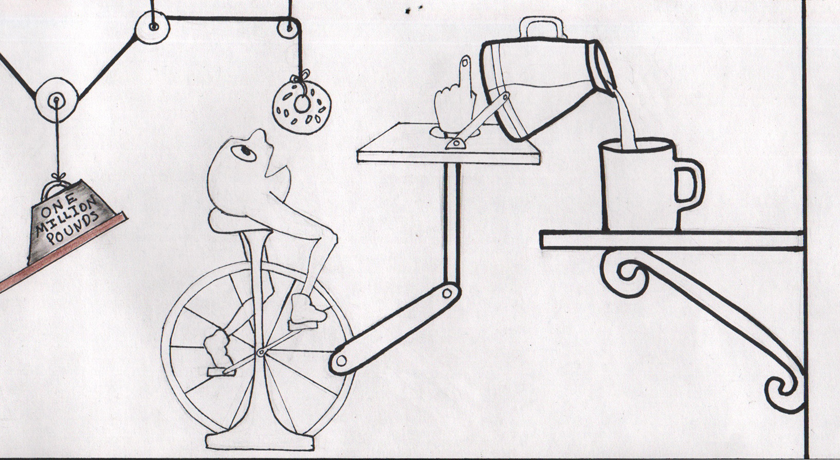
Rube Goldberg Machines
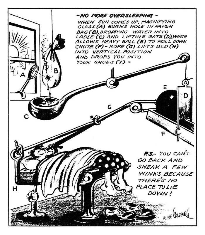
|
Rube Goldberg (1883-1970) was a Pulitzer Prize winning cartoonist, sculptor and author. Best known for his “inventions”, Rube’s early years as an engineer informed his most acclaimed work. A Rube Goldberg contraption – an elaborate set of arms, wheels, gears, handles, cups and rods, put in motion by balls, canary cages, pails, boots, bathtubs, paddles and live animals – takes a simple task and makes it extraordinarily complicated.
One example is The "Self-Operating Napkin" is activated when soup spoon (A) is raised to mouth, pulling string (B) and thereby jerking ladle (C), which throws cracker (D) past parrot (E). Parrot jumps after cracker and perch (F) tilts, upsetting seeds (G) into pail (H). Extra weight in pail pulls cord (I), which opens and lights automatic cigar lighter (J), setting off skyrocket (K) which causes sickle (L) to cut string (M) and allow pendulum with attached napkin to swing back and forth, thereby wiping chin.
|
Your Assignment:You will design a Rube Goldberg machine. You will not be building the design, it is drawing only, so be as whimsical and impossible as you want.
Your finished piece will be done on either a piece of 9" x 12" or 6" by 18" inch paper, and will be rendered in marker and watercolor pencil. Think: comic strip. This drawing should be fairly similar to the way a comic strip is drawn. Contrast and value will be very important elements in this design. Use hatching and crosshatching to create value. Depending on how successful the design is in black and white, you may not need color. You do not need to include text in your design, but if you do, think about how to incorporate the text so it is an integrated part of the design. Your machine must complete its task in no less than 6 steps. |
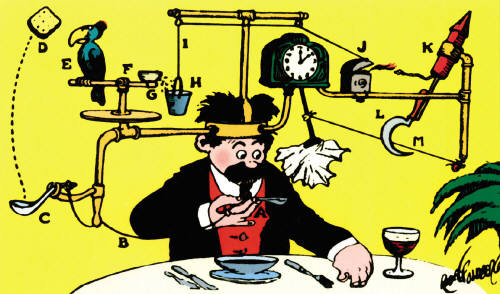
"Self Operating Napkin"
Download the file below for the demo on how to color in Photoshop:
Click here for a link to a video on how to use Photoshop to color. (school friendly)
| ||
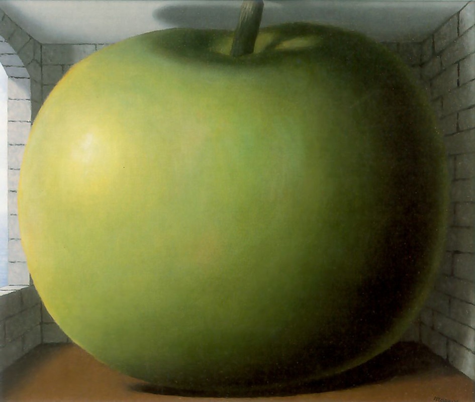
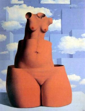
Breadth :
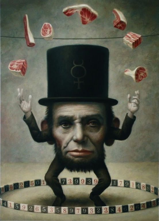
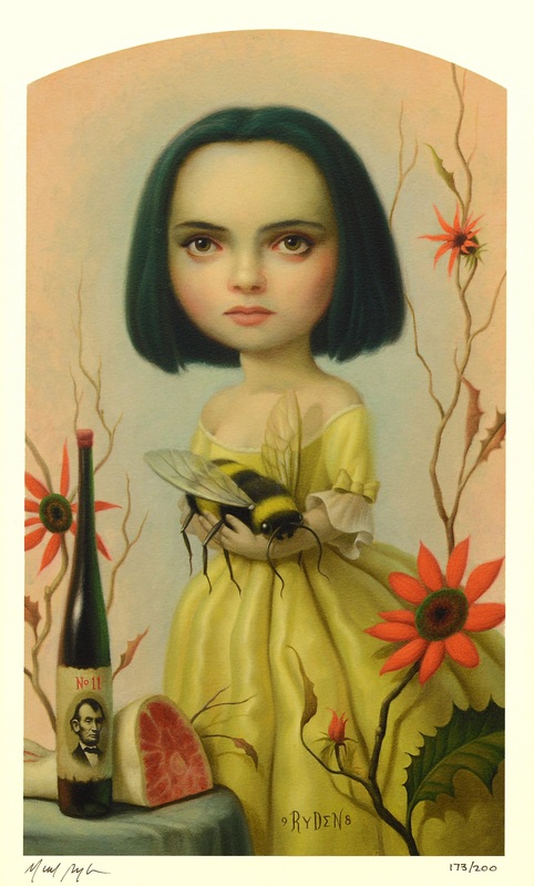
Proportion
Proportion refers to the relative size and scale of the various elements in a design. The issue is the relationship between objects, or parts, of a whole. This means that it is necessary to discuss proportion in terms of the context or standard used to determine proportions.
Your next breadth project will involve an exploration of proportion. The subject matter and medium is up to you; keep in mind, the principle of proportion must be evident in the work.
Below are examples of art which use proportion as one of the main principles:
Your next breadth project will involve an exploration of proportion. The subject matter and medium is up to you; keep in mind, the principle of proportion must be evident in the work.
Below are examples of art which use proportion as one of the main principles:
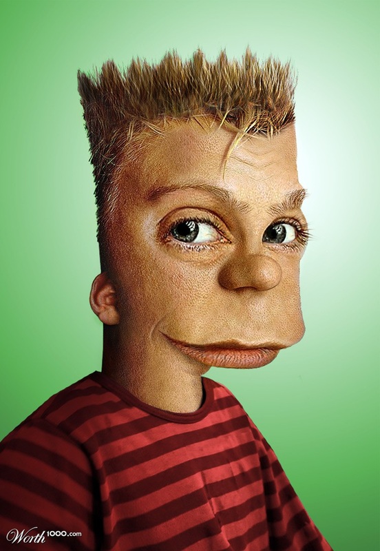
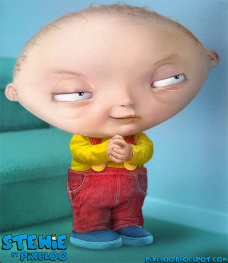
Breadth :
Distorted Warhol Self Portraits
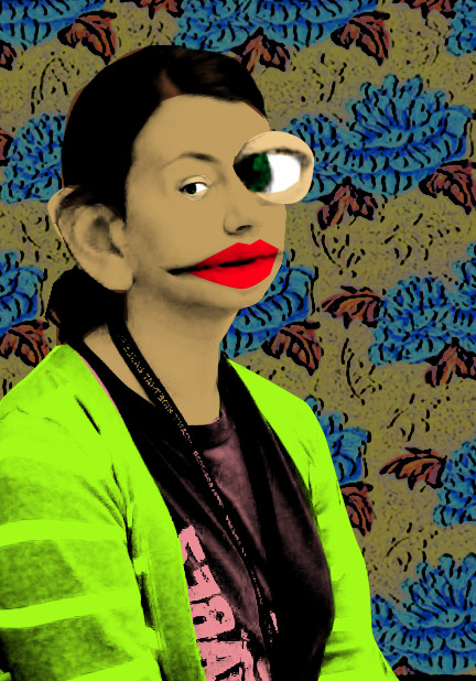
|
In class we will be distorting a picture of ourselves using Photoshop. Once that is done, we will be applying an Andy Warhol style effect to the portrait.
Link to the Warhol tutorial: http://www.pxleyes.com/tutorial/photoshop/1377/How-To-Create-An-Andy-Warhol-Serigraphy-Effect.html |
